BRANDING / EXHIBITION
Gelazen Gelato
Objective:
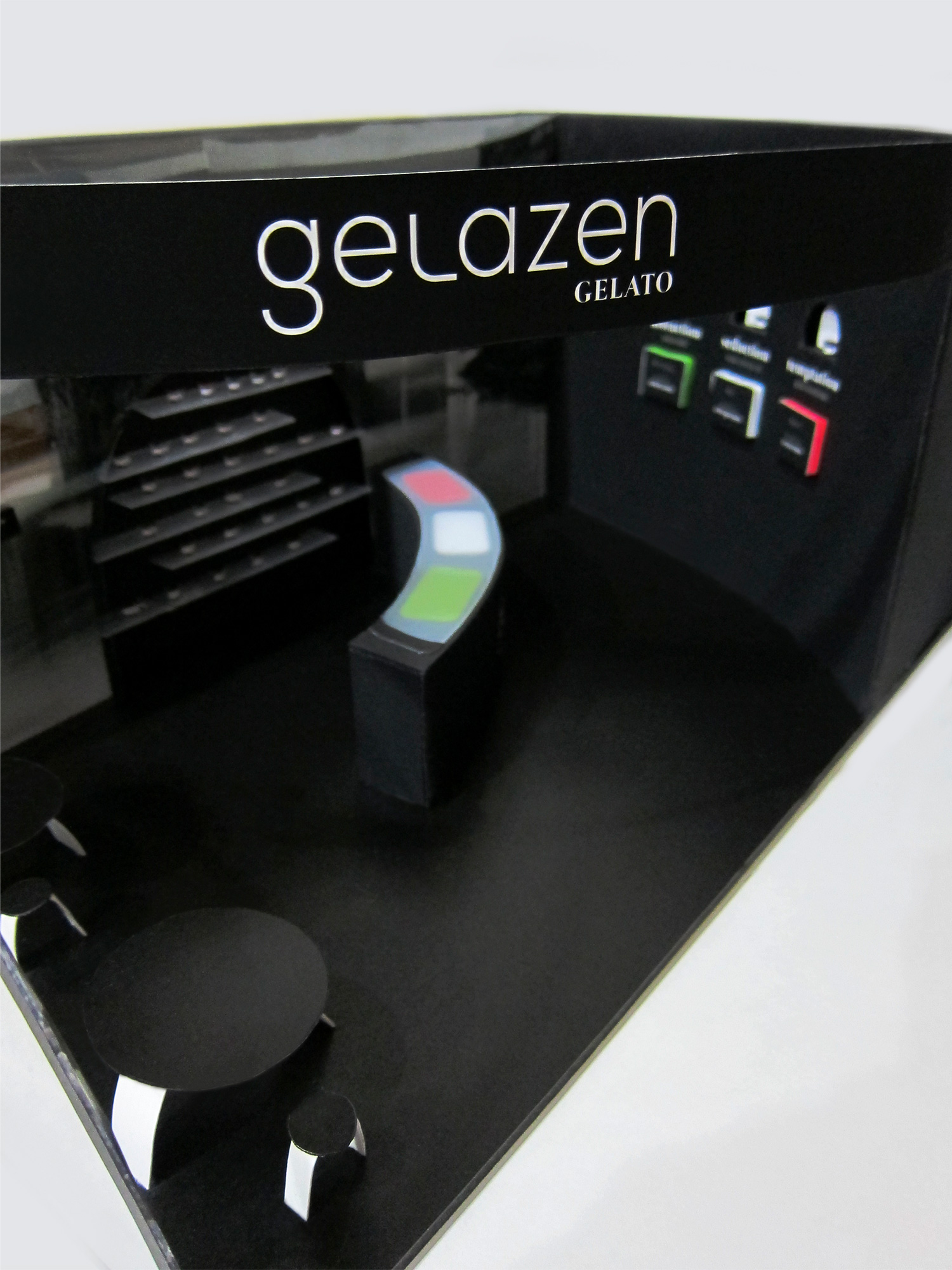
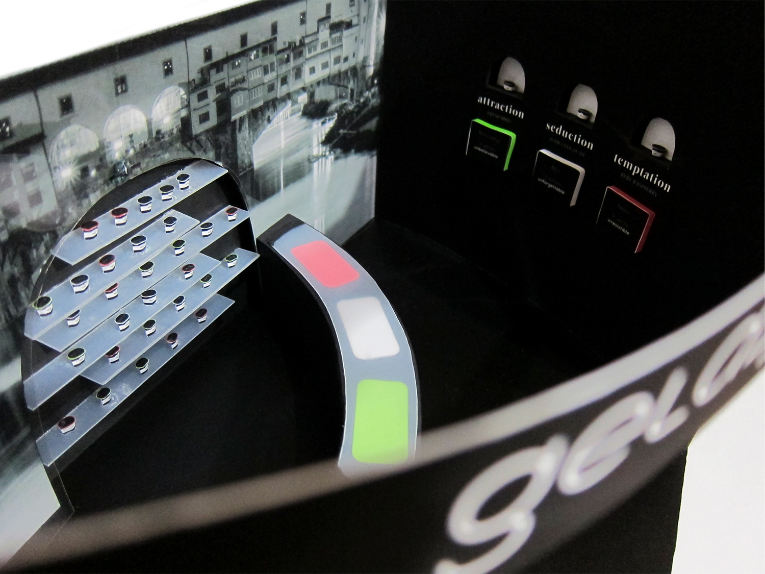
Develop, design, and produce an exhibition campaign.Concept:
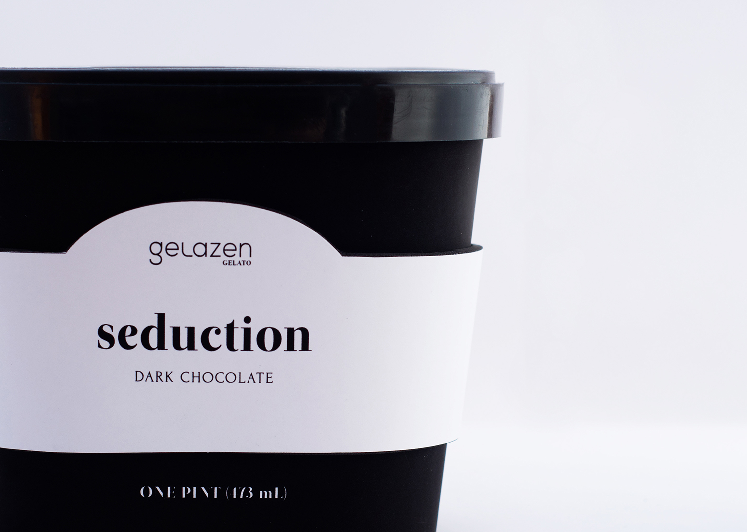
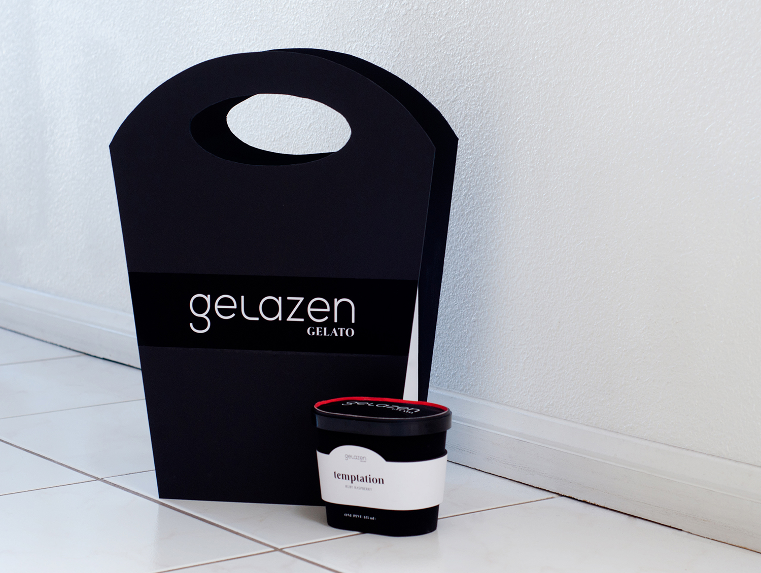
The Gelazen Gelato brand represents Italy and its creamy gelato dessert. The name, Gelazen, is derived from combining the words, gelato and frozen. As Italy is known to be a romantic city, the flavors of Gelazen are related to the idea of romance. The use of mostly black and white on the packaging emulate the classy feel and rich flavor of the food product, while the accents of the red, green, and white colors on top of the packaging for each flavor pay tribute to the flag colors of Italy.In the trade show exhibition design, the floor area accommodates for a large number of visitors by having a wide, open area. The flavors are available for sampling at the counter, while pints of gelato are displayed behind on shelves, available to the public for sale. A couple of tables and chairs are also provided for visitors who need to rest. This trade show exhibition accounts for the massive crowd, as well the comfort of the visitors.